
The other day, I was looking at Hans Rosling's powerful animation of data on the health and wealth of all countries since 1800, which allows you to literally see the patterns in these data. Notice how all countries (each represented by a bubble, color-coded by continent) shift upwards and to the right, indicating increases in health and wealth over time, except that Africa -- represented by the blue-colored bubbles -- lags behind.
It got me to wondering, since data visualizations can be static, interactive, or animated, when does it make sense to present data using one format or the other?
So I decided to re-create Rosling's animation for US counties. I animated data on the life expectancy and median income of every US county since 2003.
In the animation below, the y-axis shows countywide life expectancy, and the x-axis median income for the county (not adjusted for inflation).
Given my political science bent, I decided to see if I could use this exercise to learn something about the 2016 election and color-coded each county so that the green bubbles correspond to counties where Hillary Clinton won a majority of votes in the 2016 presidential election and the red bubbles to counties where Donald Trump won at least 80 percent of the vote. (Counties where Trump won between 50 and 80 percent of the vote were excluded from this analysis.)
Life Expectancy and Income, 2003 - 2014 by Vote Share
See any interesting pattern here? If so, then your eyes are better than mine.
So I decided to look at the data slightly differently. I calculated the three-year moving average of life expectancy and median income for 2004 and 2014. (This is just a fancy way of saying that I added together the life expectancy values for each county in 2003, 2004, and 2005 and divided by three and then did the same for median income and then repeated this for 2013 - 2015.) I then used those values to calculate the percent change in life expectancy and the percent change in median income by county over this time period.
Let's see how this looks in a static data visualization, (where I've also coded the size of the bubbles to be proportional to the population of each county in the 2010 Census).
Life Expectancy and Income Gains 2004 - 2014 by Vote Share
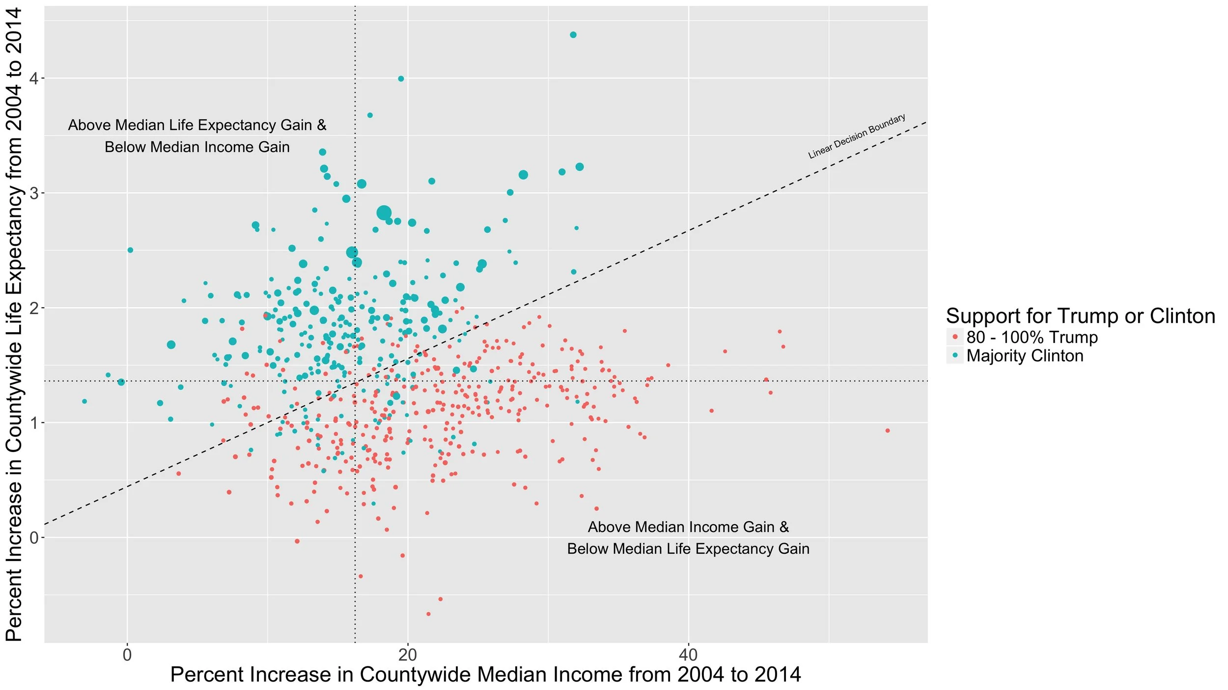
Now we're seeing something. Basically, the Trump-voting counties got wealthier from 2004 to 2014 while the Clinton-voting counties got healthier. (To be a little more precise, because very few counties got either less wealthy or less healthy, the Clinton counties generally saw larger life expectancy gains than the Trump counties, while the Trump counties generally experienced greater income gains than the Clinton counties.) The dashed, diagonal line, generated from a logistic regression, does a nice job of separating the Clinton counties from the Trump counties based on life expectancy and income changes.
But there's certainly more to the story than this. The two primary variables (life expectancy and income gains) are themselves products of phenomena, such as the education level of the population, that also affect how people vote. So if we think about why different counties experienced different degrees of change in income and health from 2004 to 2014, we could imagine that some places, just by virtue of local culture, geography, or industry are more or less likely to experience gains in income and health over time than other places. On the other hand, we could also imagine that the differences we observe over time could have resulted not from anything unique to those places, but rather from a change in who lives there.
The static visualization demonstrates the first explanation very clearly. If we look only at the colors, we might conclude that there is something systematically different between the places that voted for Clinton and the places that voted overwhelmingly for Trump.
Making the size of the bubbles proportional to county population suggests the second explanation of what might be driving the changes. Since the green bubbles, on average, are larger than the red bubbles, the divide could be reflective of a trend of younger people, who were more likely to vote for Clinton and who are healthier but who generally earn less than older folks, moving to the cities, which have seen greater life expectancy gains but slower income gains than the Trump counties.
So far, this discussion has omitted race, which is a significant factor in any analysis of American politics. Therefore, in the interactive visualization below, I have made the size of the bubble proportional to the percent of the population in the county that is not white, meaning that large bubbles correspond to counties where a significant segment of the population is not white and small bubbles to counties that are predominantly white. To get at population, the interactive tooltip displays the county and state indicated by each bubble.
Life Expectancy and Income Gains 2004 - 2014 by Vote Share
Mousing over the green bubbles reveals that the counties with greater life expectancy gains and lower income gains from 2004 to 2014 are counties in urban areas, such as Bronx (New York), Orange (Orlando), and Fulton (Atlanta) counties, while the red bubbles represent more rural counties. In other words, the visual "evidence" is consistent with either the place-based or the changing composition explanations of the underlying processes at work in shaping the 2016 election results.
Although these visualizations in no way represent any sort of empirical analysis, they do suggest some intriguing lines of investigation for further exploration -- one of the most valuable aspects of data visualization -- and actual data analysis. More on that to come.
In the meantime, lets return to the question that motivated this post. Does this mean that interactive visualizations are always "better?" I'm sure you understand well that the answer is, "Of course not, silly question asker." Rather, it just indicates that in this instance presenting the data in interactive form conveys a lot more information than either the animated or the static visualizations. In other words, the tldr for this post is that the visualization you choose to create depends on your data and what you're looking to learn.